Max Sher: Palimpsests

MaxSher.com

Max Sher, of Moscow, spends his time as an artist in the back streets and quiet spaces of modern-day Russia. He recently published Palimpsests, his second book.

I had some difficulty with the title, and needed the dictionary, as I’m sure most people would. Merriam-Webster defines a palimpsest as “writing material (such as a parchment or tablet) used one or more times after earlier writing has been erased.” And “something having usually diverse layers or aspects apparent beneath the surface.”

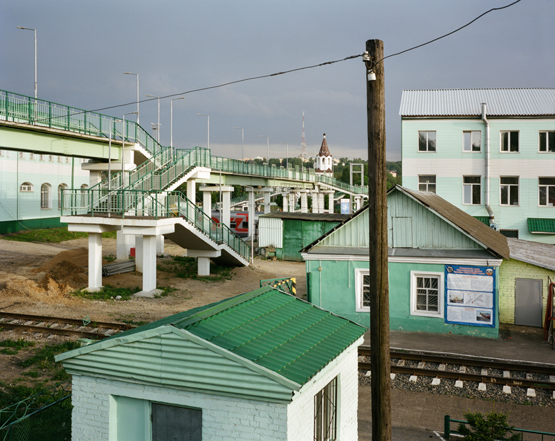
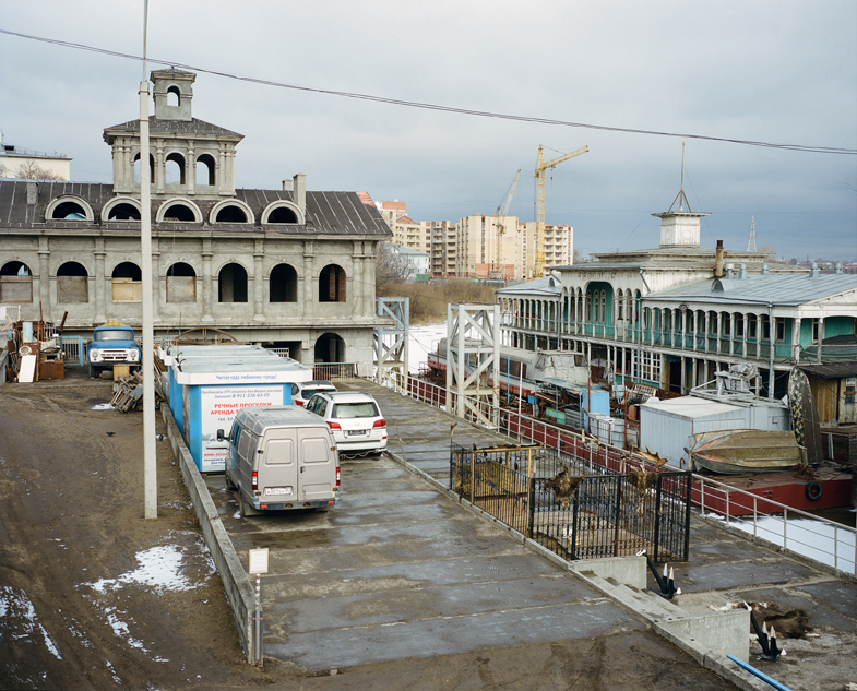
In an email exchange, Sher said he wanted to use the term to draw attention to the layers of landscapes: the pre-Soviet, the Soviet, and the contemporary. All exist delightfully jumbled together in his images.

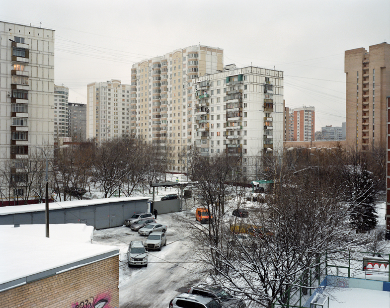
Sher’s pictures are still, but very moving. He rarely includes people, so one’s attention goes to the buildings of various ages, designs and states of repair.

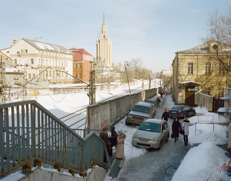
In an image below that shows a small group of people (tellingly, they are in the shadows), Sher contrasts the striking appearance of a tall tower in the distance with a foreground of an aging iron railing, concrete walls covered with graffiti, and a shabby lane that appears to be both a sidewalk and an informal parking area.

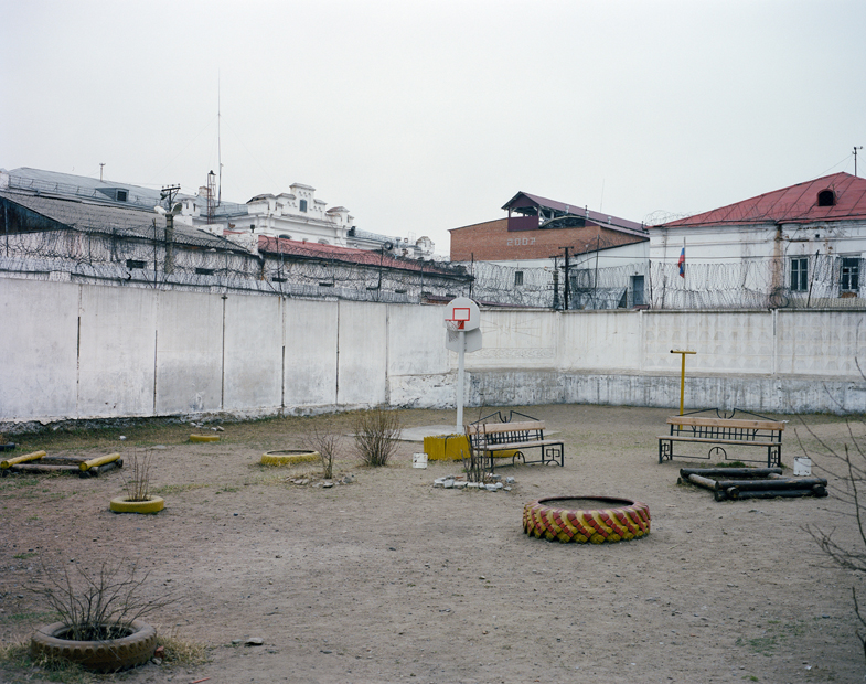
Also below is an image that at first glance appears to be of a playground: there’s a big tire filled with sand and a couple of basketball hoops. Then one notices the barbed wire at the top of the walls and it seems more like a prison recreation yard. And this is where the concept of “palimpsest” becomes so helpful: there’s a kind of nightmare in which one thing becomes confused with another beneath its surface: a prison becomes a playground and vice-versa. A sidewalk becomes confused with a parking lot.

Sher included over 100 images in the book. He created an online flip-through of the entire book.

I asked Sher why this project was so important to him (he spent seven years on it). In an email he told me:

“The urge was to create a visual language of my own with a twofold purpose: on the one hand to overcome the heritage of the Soviet Socialist Realism (when photography and other arts were supposed to depict life “how it should be”, and not “how it is”, and that’s why the landscape of the everyday was almost non-existent in, stamped out from the Soviet photography as a viable theme in itself, although it did exist in Russian photography before Socialist Realism took over (in early 1930s); on the other hand, realizing how the post-Soviet area is still mostly depicted outside – as still a very “exotic”, “other”, “weird”, etc place, I wanted to challenge that perception too by focusing on the mundane, not weirdness or exoticism, the latter being rather mental constructions than something that exists here in “real life”.

Sher’s achievement is to show the wild diversity of landscapes in modern-day Russia, and to suggest thereby a confusion in Russian life itself. The value of his book is that the confusion of spaces and lives exists in many other parts of the world.
Book Review: No One’s Land

No One’s Land

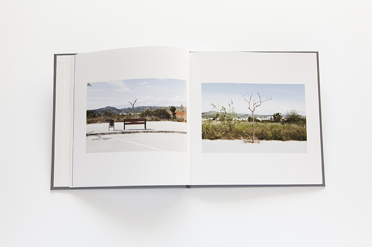
This stunning book from Ricardo Dominguez Alcaraz, a Spanish artist, is a step up in the world of print-on-demand. The images were selected and sequenced by José de Almeida, of the Camera Infinita publishing house. Peecho, the Amsterdam-based print-on-demand company, printed the book with subtle color and tonal variations.

My copy was mailed to me from Seattle, USA, and I understand that Peecho uses a distributed model of printing, with partners around the world.

Alcaraz told me that he and Almeida supplied images that they thought would print well through Peecho and were pleased with the first copy of the book they ordered. (Another Peecho user told me that he had to order a sample book and then resubmit his images after some toning adjustments.) In any case, the book is more attractive than ones I have made through Blurb, and quite a bit less expensive. I will be using Peecho in the future for my self-publishing.

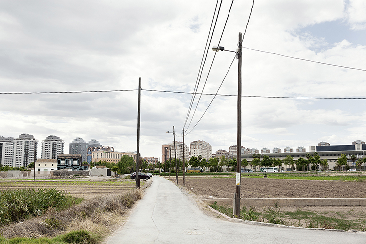
Alcaraz’s book is full of intriguing images of suburbs, “intermediate places that are absolutely necessary for the city,” according to his introduction. My only complaint about the book is that Alcaraz’s thoughtful introduction is rendered in not-quite-perfect English. This is made up for by the eloquence of his images, which can be universally appreciated. He makes a poetry of wooden pallets, stunted trees, billboards, roadsigns and other ephemera of the suburbs.

Almeida skillfully sequenced the images into a flow that links one picture to another, building a work that is more powerful than any individual image. His touch demonstrates the value of a careful and thoughtful editor. Alcaraz told me in an email that he saw his work with fresh eyes when presented with Almeida’s sequences.

No One’s Land is a treat, and reminds me once again of how powerful the printed image can be when sequenced into a carefully-made book.

— Willson Cummer, Fayetteville, New York, USA

Book Review: Perspectives on Place

Perspectives on Place

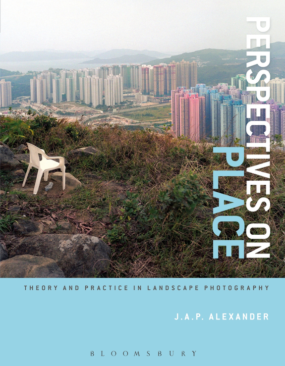
Perspectives on Place, by J.A.P. Alexander

This book sets out to survey “theory and practice in landscape photography,” and does an admirable job, considering the long history of portraying the landscape in painting and photography. Alexander gives introductions to a variety of subjects, such as the sublime, that are useful to understanding contemporary landscape photography.

He organizes his book into an introduction and five chapters, on such topics as “Defining Nature” and “Landscape and Power.” In each chapter, Alexander combines a discussion of the practical aspects of photography and project-making with the aesthetic considerations of artists who have explored this genre. He also makes it clear that successful photography is more than just showing up; it’s a matter of research and reflection.

In Alexander’s first chapter, “Taming the View,” he weaves together a consideration of tripods and camera formats with Robert Adams’ thoughts on geography, autobiography and metaphor. Those three elements can be combined successfully in landscape photography to bring out the richest compositions, according to Adams.

In the books’ second chapter, “Defining Nature,” Alexander draws our attention to 18th-century discussions of the sublime, beautiful and picturesque, three ways of describing the landscape — first by painters, then eventually by photographers. Alexander introduces images by contemporary artists who challenge easy notions of beauty.

The book is well-illustrated, with photographs from early artists such as Timothy Sullivan and Carleton Watkins, to contemporary artists such as Penelope Umbrico, Nadav Kander and Celine Clanet. Alexander also uses reproductions of paintings to make points about art history that are pertinent to painters and photographers.

Alexander has created a book that should be useful to artists, teachers and anyone interested in a nuanced presentation of issues in contemporary landscape photography. The book is published by Bloomsbury.

— Willson Cummer

© JAP Alexander

Photo © J.A.P. Alexander

Book Review: Tōhoku

Hans-Christian Schink

Tōhoku, by Hans-Christian Schink

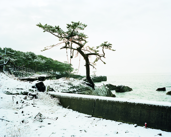
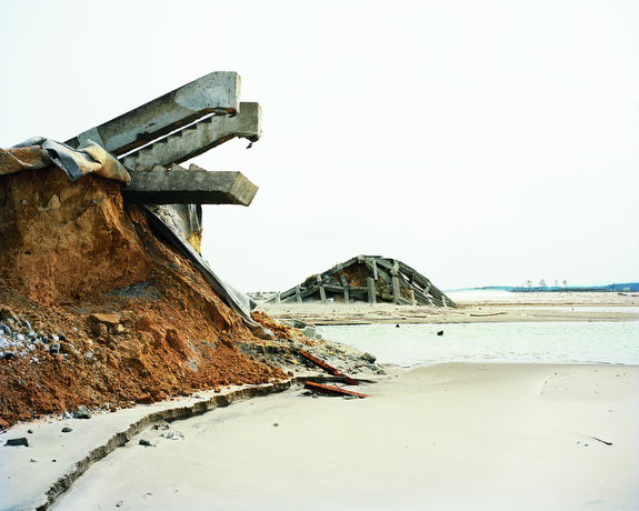
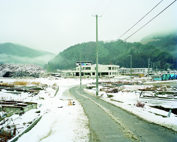
Schink, a German landscape photographer, returned in 2012 to the scene of a tsunami that devastated Japan a year before. He photographed the Tōhoku region, where the worst damage occurred.

The opening images of his book are filled with snow, where nature has blanketed scenes of disaster. These pictures are dreamlike: surfers stretch on a snow-covered beach, preparing to enter icy waters already filled with over a dozen surfers. Schink favors a milky-white sky, which blends together with the ground in the snow scenes. This creates a sense of dislocation that perfectly suits his subject.

Many of the pictures are mysteries. We truly don’t know what we’re looking at. Others document houses tossed off their foundations, rows of empty lots — surely once occupied — and vacant fields. There is a bus on top of a two-story building, calmly upright as if parked there.

Schink’s images beg for enlargement, as the smallest details are often key to their understanding. They are presented at 8×10″ in the book, but would be best at 4 by 5 feet, at least, as Schink often stands a great distance from his subjects.

The book was published by Hatje Cantz.

© Hans-Christian Schink

© Hans-Christian Schink3

Book Review: Postcards from Europe 03/13

© Eva Leitolf

Postcards from Europe 03/13, by Eva Leitolf

Eva Leitolf’s book Postcards from Europe 03/13 appears at first to be simply that: a collection of 20 large cards gathered together and presented as a book. The cards have 10.5 x 13″ images on the front and text on the back. But instead of cheery notes, Leitolf supplies grim statistics about the hazards of illegal immigration into Europe. She recounts deaths, riots and other affronts to the migrants.

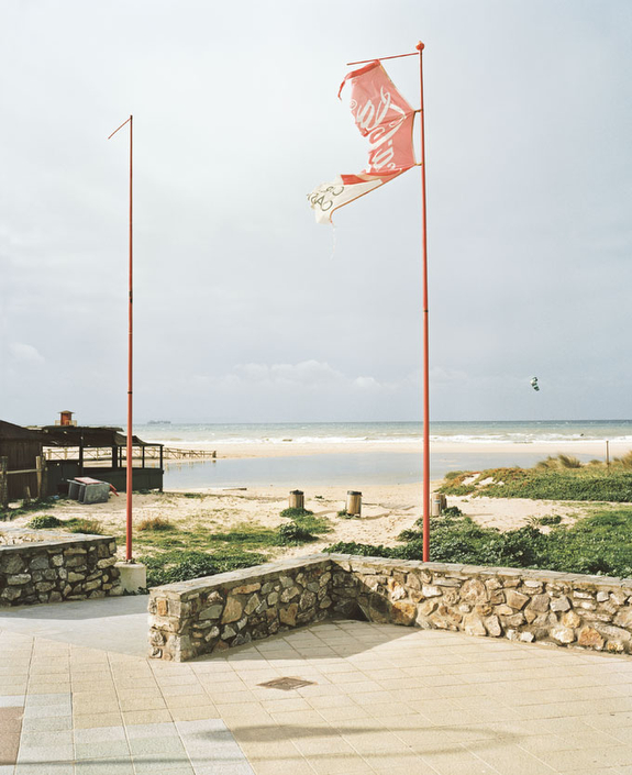
Leitolf’s images are often banal landscapes, which become filled with meaning as we move through the book. Sometimes there are clues in the images: a security fence, a pile of wooden ladders, chairs knocked over. Other times we see simply a desolate beach. Only on turning over the card do we discover that 24 bodies of would-be immigrants washed up on that beach.

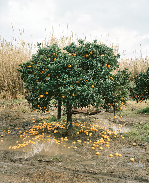
The book is a collection of puzzles. Once we know that, our enjoyment of the images increases. Why are dozens of oranges on the ground under a tree in one image? What is the meaning of a humble wooden platform about 15 feet off the ground at the edge of a field? We know that we’ll have the answer once we flip the card.

Because the images in Leitolf’s book are not bound, they draw comparison to prints. This is unfortunate. The plates are printed using four-color offset presses, and are well made. But they do not approach the quality of inkjet prints or traditional color prints. (Of course one could not buy a collection of 20 prints for the price of a book — but the presentation invites comparisons between the two.)

Leitolf, a German photographer, made images in Italy, Spain, Greece and Hungary for this book. Postcards from Europe 03/13 is available from Kehrer Verlag.

© Eva Leitolf

Book Review: Wald

Wald, by Michael Lange

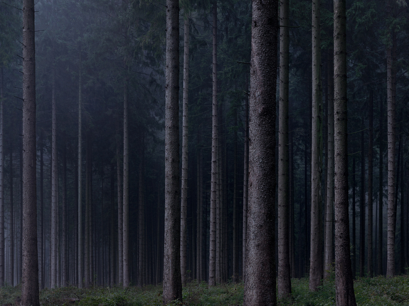
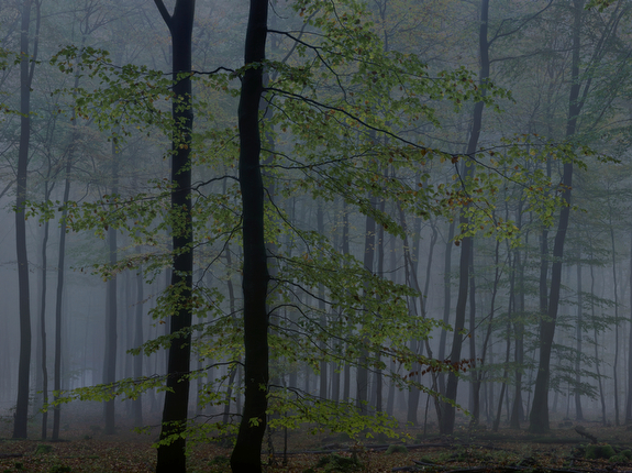
In Wald (The Woods), German photographer Michael Lange explores the twilight hours of dawn and dusk in the forests of his country. Gloomy at times, glowing at others, the images present a complex view of the woods. Nothing human ever appears — no people, no houses, no signs, no trash. Lange creates a storybook forest; a forest of dreams. As poet Wolfgang Denkel writes in the book, “This is not a place we go — it is where we have always been, unaware.”

And what are the pictures of ?? Stands of pines, tangles of deciduous branches, ferns, leaves fallen into water. There’s never any direct sunlight — these pictures were made in the hour before dawn and the hour after sunset, when only a long exposure could capture enough light to create an image. Perhaps because of this dim light, the pictures avoid being nature photography. They are more mysterious and muddier than calendar photos of forests. And Lange’s composition, which declines to offer points of attention in the images, makes the work compelling.

Lange dedicates the book to Joko Charlotte Beck, his Buddhist teacher. And his meditative approach to the woods is partly the result of his 20 years of practicing Buddhist meditation — though he stressed in an email to me that the book should be understandable to anyone.

— Willson Cummer

Review: Looking at the Land

Looking at the Land, curated by Andy Adams

As Adams notes in his introduction, many of the photographers included in Looking at the Land grew up in the suburbs, and have little experience with the wild. They are the heirs to the New Topographics style of photography.

Many of the photographs in this broad survey share a similar aesthetic: straightforward images of a place, but often tinged with irony or humor. Adams has created an exceptional viewing experience: there’s a 17-minute video of the photos and also an online catalog of each of the 88 images along with interviews with most of the artists. It’s fascinating to navigate through the interviews, reading the ones attached to the images that catch your interest.

The exhibit accompanies a show at the Rhode Island School of Design that investigates landscape photography from 1865 to the present. While the RISD show will be up for only a limited time, Adams plans to keep his exhibit online indefinitely. Adams, who produces the website Flak Photo, has also narrowed his focus to images made in the 21st century.

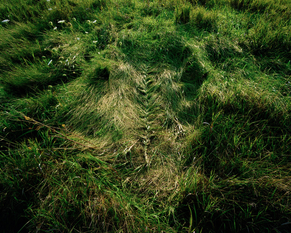
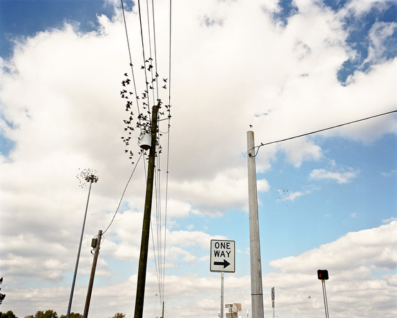
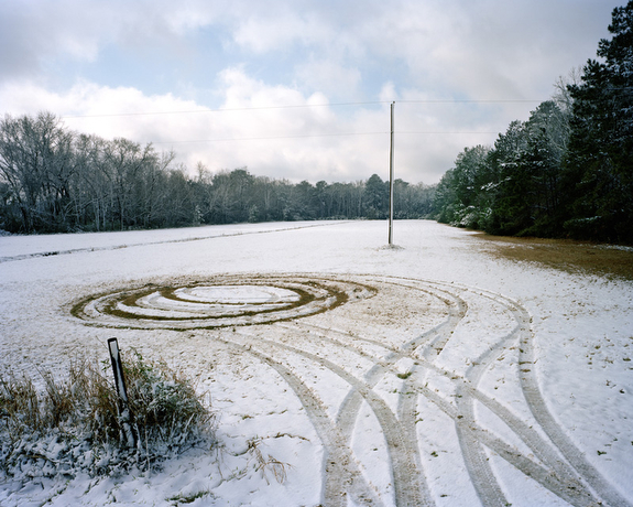
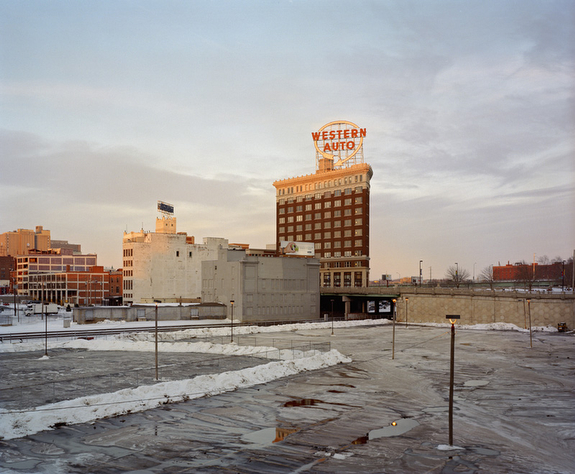
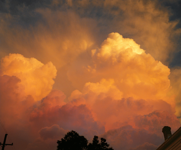
Some of the more memorable images, for me, were Chuck Hemard’s photo of flocking birds on telephone wires, Eliot Dudik’s image of tire tracks in snow, Jennifer Ray’s placement of woven grasses in a field, Mike Sinclair’s Kansas City street scene and Sophie T. Lvoff’s cloud scene photographed in New Orleans.

I was surprised to see how many of the images were beautiful in a classical sense, rather than ironic. Lvoff’s cloud image, for example, shows a gorgeous orange and peach-colored sunset. Her interview confirms my impression: “The way the sky unfolds every day is unique and has to do with the humidity here — so I photographed the roof of my house and surrounding trees on my street during an epic weather moment. It’s beautiful.”

Rather than critique humanity’s interactions with nature, some of the photographers consider ways to improve it. Ray writes this about her grass sculpture: “I began to think of how I could make a model of this symbiotic relationship — how I could depict nature manipulated, but unharmed, by humans. I spent two days sitting in this pasture, braiding grass, and trying to find the right topography, form, and time of day. As a gesture, the braid is gentle and impermanent, undone with the next windstorm or downpour.”

The photographers Adams has brought together provide a more hopeful vision than was presented in 1975 at the New Topographics exhibit in Rochester, New York.

— Willson Cummer

Book Review: Haboob

Haboob, by Andrew Phelps

One of Andrew Phelps’s most powerful subjects in his new book, Haboob, is Nothing.

Haboob documents the effect of the economic downturn on Phelps’s hometown of Higley, Arizona. The book’s title is the Arabic name for the seasonal desert winds that sweep through the region.

One of the Nothing photos shows the wonderfully-named intersection of Buckaroo Trail and Liberty Lane. The sign for Liberty Lane is slightly bent. The remarkable thing about the intersection is that there are no houses or buildings of any kind there. In the distance, we see upscale homes, but at Buckaroo and Liberty there’s nothing.

Another Nothing photograph seems to riff on Ansel Adams’s famous shot of a moonrise in Hernandez, New Mexico. Adams filled the middle ground with a small church and gravestones — signs of the life and death of a community. But Phelps’s moon rises over nothing — a pole and road sign in the foreground, bare desert stretching through the middle ground, toward a tiny distant line of green.

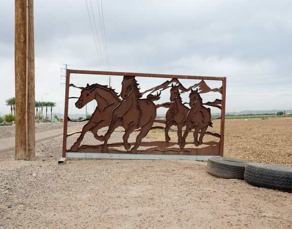
Many of Phelps’s photos document loss: a ruined palm tree, a fountain sitting in the middle of a large field of gravel. Other pictures show confusion: paint color swatches scattered on the ground, iron mustangs on a gate to nowhere, church signs and political signs in a desolate stretch of road.

Haboob is a beautiful and grim meditation on emptiness and destruction. The book is published by Kehrer Verlag.

— Willson Cummer

Book Review: Where Will You Spend Eternity ?

Where Will You Spend Eternity ?, by Sylvia de Swaan

De Swaan’s photobook contains poetry, an essay, an artist’s statement and an account from a couple who visited Utica, New York and stayed with de Swaan. The book is a meditation on her adopted hometown, a small post-industrial city in Upstate New York.

The 84 photos included are subtle, building as a body of work, a visual poem.

Take this extended sequence: an image of a snow-covered back yard leads to a picture of a snow-covered statue of Jesus, then a picture of a yellow ribbon in a wintry yard. Next we see a pattern of snow on paving stones — broken very faintly by one person’s footsteps. The series continues with a snowy scene of a house with a large peace symbol spray-painted on its door, and the word “peace” written on the front of the house.

De Swaan continues this riff with an image of a garage painted with the words “world peace in the streets.” Someone has spray-painted a thin black line through the phrase — still leaving it entirely legible. On the facing page is a bullet hole in a window. Turn the page and see blacktop with two figures painted onto it, appearing to walk toward each other. The final image in this series is a boarded-up house with the words “peace in the streets” painted on it. This time none of the words are crossed out.

While many of the photos portray a gloomy rust-belt landscape, de Swaan includes signs of hope: the Cambodian Buddhist procession, the painted wall with an image of Martin Luther King, Jr., the freight train with the words “No Remorse !” painted onto it. She also creates humor, as when she pairs a trailer with an image of a slumbering woman opposite a shot of a McDonald’s sign urging us to “Wake up Happy.”

De Swaan’s book title asks about eternity, but the photographer is fascinated by the details of the here and now — how we live out our days — whether at war or at peace, in wealth or poverty, alone or together.

Where Will You Spend Eternity ? was self-published, and is available through Blurb.

— Willson Cummer

Book Review: Winterwald

Winterwald, by Emanuel Raab

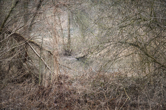
Emanuel Raab’s book opens with a photo that includes a tree in the middle distance. It looks like it would be easy to enjoy climbing, with a thick trunk and low branches. But between the viewer and the tree is a screen of leafless vines and brambles that makes it almost impossible to approach.

Throughout Raab’s book (Winter Forest in English) these kinds of screen occur. We are in the “natural” world, but nature is blocking off access to herself. Raab presents streams, trees, and unknown bodies of water that are hidden behind impenetrable growth. There are no paths or trails in his photographs. We are unable to walk into the forest of our dreams — with large trees, clear paths and little undergrowth. Instead we are stuck in an impenetrable wilderness.

Eventually my focus moved toward the screens themselves, which are beautiful in an unconventional way. Flecks of red brambles, green moss, small leaves and curving vines create a surface of abstract delight. Raab photographed sometimes at dusk, resulting in a murky background that fades away from the viewer. He usually throws the background out of focus, increasing its distance from us.

Winterwald will not be available for sale in the United States, but may be purchased directly from its German publisher, Kehrer Verlag.

— Willson Cummer