Alexander Diaz

© Alexander Diaz

www.AlexDiazPhoto.com

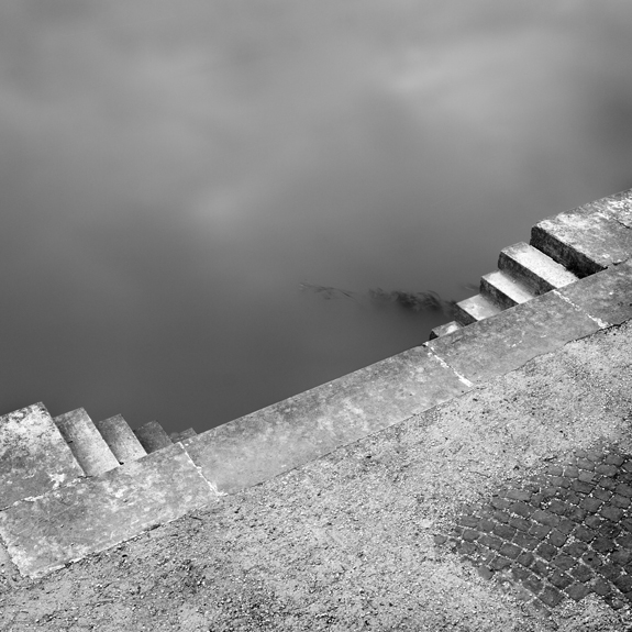
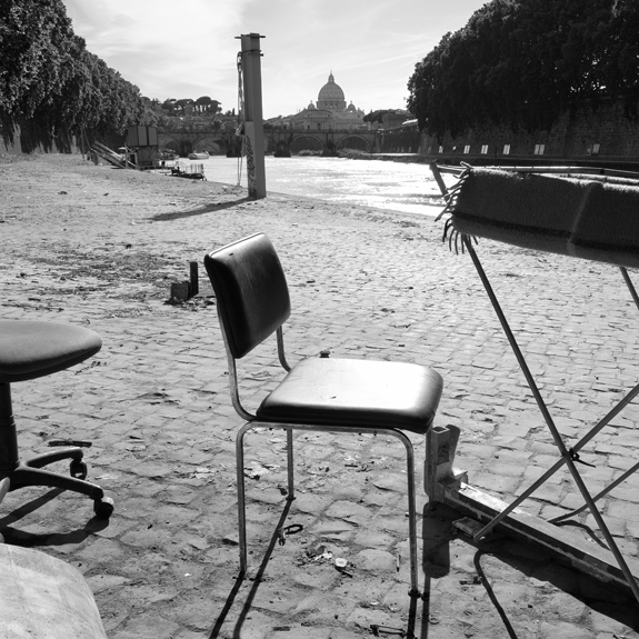
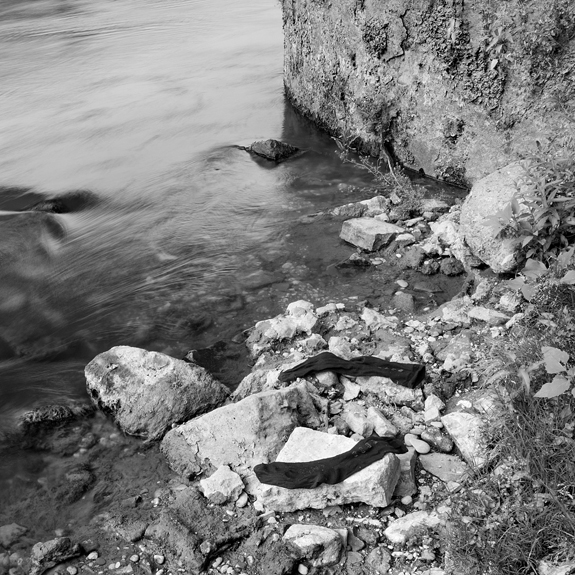
The city of Rome is truly one of the most beautiful places in the world with its magnificent churches, ancient ruins, and picturesque views. These defining characteristics entice millions of visitors to Rome each year resulting in a city overflowing with tourists. Among the congestion and noise of the city, flows the Tiber River, which is segregated from its urban environment due its low elevation and towering embankments.  As a result, the river and its environs are underutilized, poorly maintained, and starkly different from the bustling streets of Rome.
 
The area between the river’s embankments is an intermediate zone where nature and culture converge. The unique ecosystem of the Tiber is complex and quite fascinating. Although the river is inundated with trash and contaminated from the city’s runoff, nevertheless it continues to provide habitat to a variety of animals as well as offers refuge for many of the city’s inhabitants, especially the homeless. The Tiber River represents the resiliency of nature and provides a framework for tourists and locals alike to contemplate the relationship humans have with the natural world.

— Alexander Diaz, St. Augustine, Florida
© Alexander Diaz

© Alexander Diaz3

Luca Orsi

DEC 16 Luca Orsi

www.LucaOrsi.net

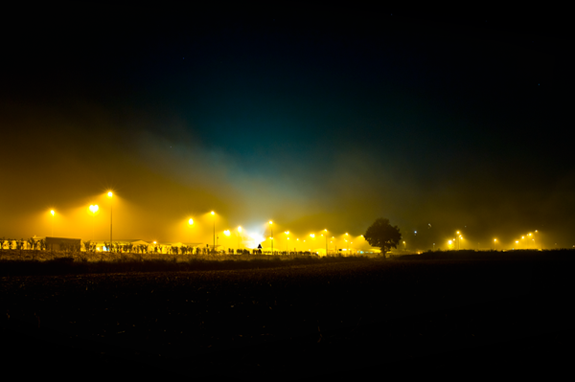
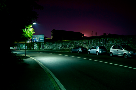
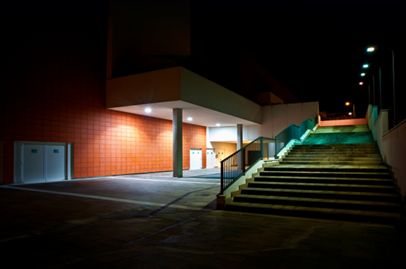
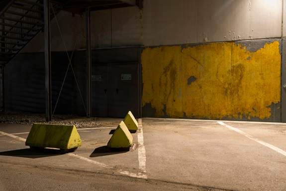
To me photographing is telling a story through the subjects of reality, creating impressions and fascination that generates questions from the people who look at my pictures. If a simple picture can generate questions in a person who then tries to know more about what he is looking at, this is simply great. This is the purpose of this project Atmospheres: trying to represent the empty urban scenes in a nocturnal mood. A mood made of contrast, rarefied lives, bright lights and gloomy shadows, quietness and tension. Everything takes on a mystical charm which is so colorful but also dark, and all seems magical and suspended as if time were frozen. This series of urban landscapes tries to explain, (through the beauty of the night’s atmospheres) the wonderful charm of the unknown.

— Luca Orsi, Varese, Italy

© Luca Orsi

© Luca Orsi3

Max Ross

© Max Ross

www.MaxwellRoss.com

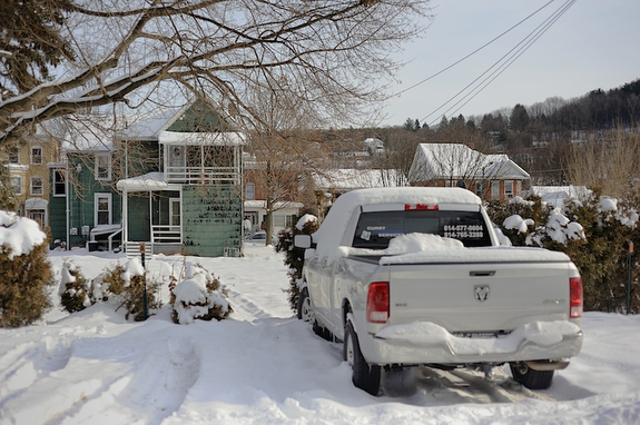
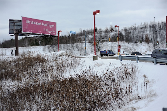
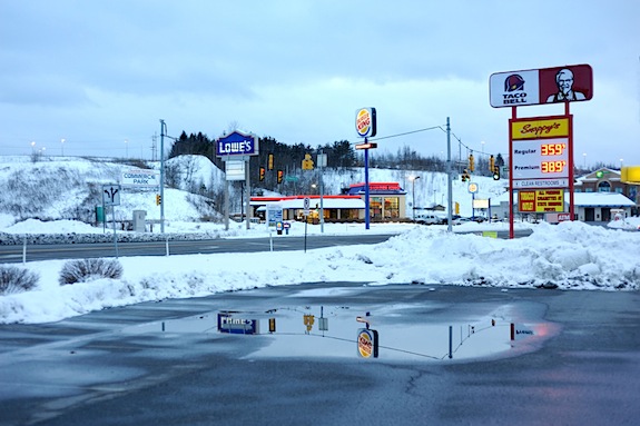
Clearfield is a portrait of a Pennsylvania town in the process of losing its local businesses to competition from international superstores, such as Walmart. Clearfield is an excellent example of what is lost culturally when town centers are abandoned for megastores, because of its long history and uniquely American roots.  Here you can find pristine examples of early American homes and WPA buildings, 50’s era movie theaters, and remnants of hundred-year-old unions and associations.  Furthermore, these institutions’ history continues to play a vital role in the lives of the citizens of this rural manufacturing town to this day. Unfortunately, if the town center economically fails, the architecture where so much of its values reside will likely go with it, to be replaced by the curiously a-historical environments of mega-marts.

— Max Ross, Evanston, Illinois

© Max Ross

© Max Ross3

Book Review: Tōhoku

Hans-Christian Schink

Tōhoku, by Hans-Christian Schink

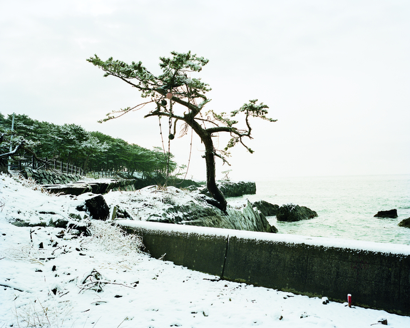
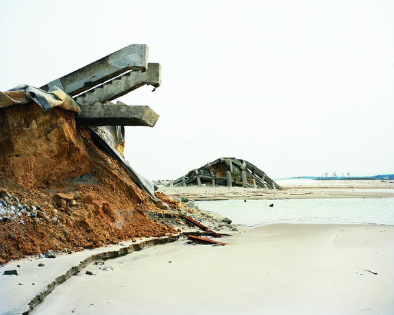
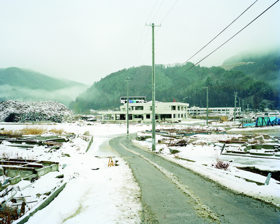
Schink, a German landscape photographer, returned in 2012 to the scene of a tsunami that devastated Japan a year before. He photographed the Tōhoku region, where the worst damage occurred.

The opening images of his book are filled with snow, where nature has blanketed scenes of disaster. These pictures are dreamlike: surfers stretch on a snow-covered beach, preparing to enter icy waters already filled with over a dozen surfers. Schink favors a milky-white sky, which blends together with the ground in the snow scenes. This creates a sense of dislocation that perfectly suits his subject.

Many of the pictures are mysteries. We truly don’t know what we’re looking at. Others document houses tossed off their foundations, rows of empty lots — surely once occupied — and vacant fields. There is a bus on top of a two-story building, calmly upright as if parked there.

Schink’s images beg for enlargement, as the smallest details are often key to their understanding. They are presented at 8×10″ in the book, but would be best at 4 by 5 feet, at least, as Schink often stands a great distance from his subjects.

The book was published by Hatje Cantz.

© Hans-Christian Schink

© Hans-Christian Schink3

Karina Azaretzky

© Karina Azaretzky

www.KarinaAzaretzky.com.ar

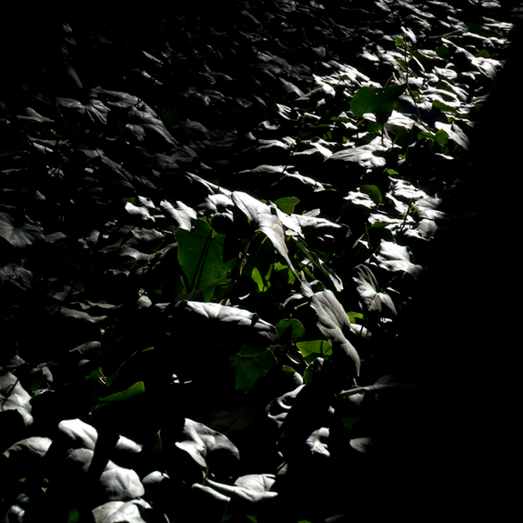
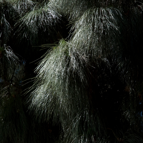
I was born in Tucumán, Argentina, a city known as “the garden of the Republic,” because of its vast natural beauty. That land left a mark on me with its greenness, its silence and its light. I grew up among the mountains, surrounded by yungas, between the leafiness of the jungle and the dryness of the valleys.

It was almost without noticing it that the geography of those scenarios started to leave its fingerprints in my subjectivity, shaping my sight.

Today, in the distance, the memories of my hometown emerge as flashes that guide my steps.

These photographs, part of a project titled The Garden, were taken in Buenos Aires’s Botanical Garden, as an attempt to find that light and greenness again. By doing so, I realized that in the end it is always about the same inner landscape that I take with me wherever I go.

— Karina Azaretzky, Buenos Aires, Argentina

© Karina Azaretzky

© Karina Azaretzky3

Ragnar Stefánsson

© Ragnar Stefánsson

www.RStef.com

I take photos of places that sing to me.

This may sound odd, but never the less it is the best way to describe my experience. I may be driving my car in the middle of the night, when suddenly a place, an object, or a house, calls my attention and I cannot go any further before I have examined it thoroughly. Then I will walk the area with my camera and learn everything I can about that specific place. Learn how the different elements relate to each other; see how the place has been modified by man.

Often I need to come back and learn more about it, to find exactly what it was that called my attention. To find out what the song is all about.

When I am sensing the surroundings I try to perceive it in an abstract way. I am not interested in the object per se, but how the space, forms and different materials are in a relationship; how the communication between objects and surrounding occur. This knowing is the song.

I am not sure what I want to achieve with my photos. Maybe to question the way we see our surroundings without really seeing it and thereby make us more aware of the process of seeing.

I studied art at Icelandic College of Arts and Crafts (Department of Painting) in Reykjavik and further at School of Visual Arts (Department of Painting) in New York. Later I took an education in psychology, first at the University of Iceland and later at Aarhus University. I work as a clinical psychologist. I live in the southern parts of Denmark but consider myself to be Icelandic.

— Ragnar Stefánsson, Sønderborg, Denmark

© Ragnar Stefánsson

© Ragnar Stefánsson

John Sanderson

© John Sanderson

www.John-Sanderson.com

“He knew at once he found the proper place. He saw the lordly oaks before the house, the flower beds, the garden and the arbor, and farther off, the glint of rails…” — Thomas Wolfe

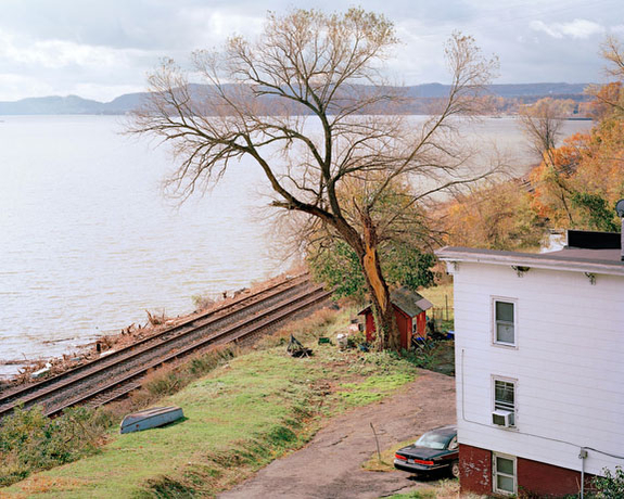
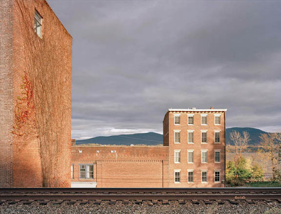
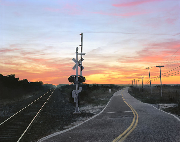
A common theme in my work is the contextual depiction of structures implying movement.

Space changes around rail lines that remain generations after their construction, places retaining a quality of transience and continual movement. The tracks flow into the distance or cut across a picture, leaving us in wonder; and yet their confident line anchors one to its path. Once bustling depots sit forlorn, objects of aesthetic pride became forgotten white elephants.  Elsewhere, tracks flow through immutable mountain passes.  

These images are a metaphorical depiction of the railroad spirit that has imbibed the American psyche since its inception.  The railroad has often been seen as an avenue of hope, loss, beauty, redemption, and so on. As a document of the contemporary railroad and a realization of Form between a rail line and the environment, these images are couched in a use of light, color, weather and shape that attempt to give the pictures a flickering, temporal quality — the allegorical representation of movement.

— John Sanderson, New York City

© John Sanderson

© John Sanderson

Tomasz Łaptaszyński

© Tomasz Łaptaszyński

www.Laptaszynski.com

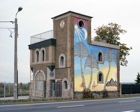
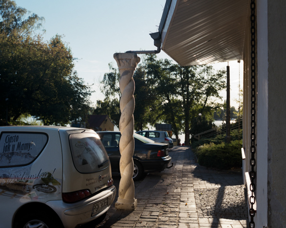
A! (Antiquity) is a project in which I’m looking for traces of antique culture in Poland.

I’m interested in finding references in architecture and popular culture which are the result of contemporary interpretation of antiquity’s output. My inspiration is great Polish fantasy, manifesting itself in diversity and originality of ideas, mainly in the field of area development.

I’m interested in pop antiquity, roadside architecture, loose associations and whatever people in Poland remember, like and cultivate that comes from antiquity. Traditional antique culture is retreating and we are attacked by its twin sister transformed by pop culture. It is the one which builds hotels shaped like pyramids or gives birth to Trojan horses standing by the roads. They are what I’m looking for.

— Tomasz Łaptaszyński, Lodz, Poland

© Tomasz Łaptaszyński

© Tomasz Łaptaszyński

Ibán Ramón Rodríguez

© Ibán Ramón Rodríguez

www.IbanRamon.com

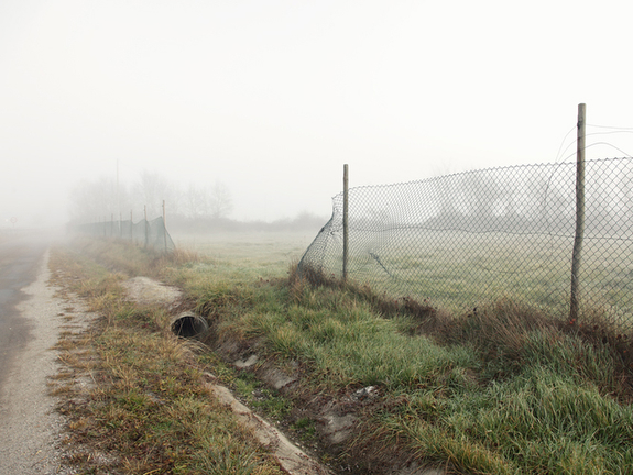
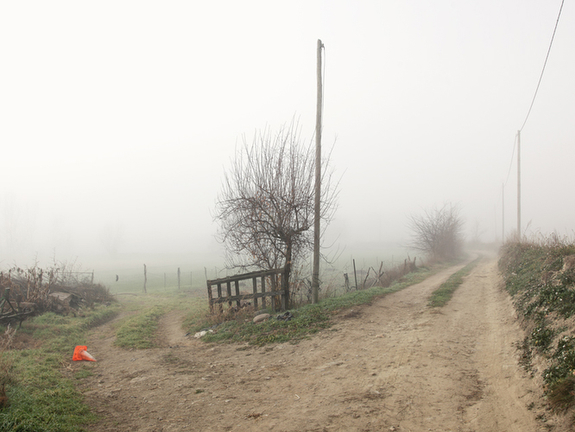
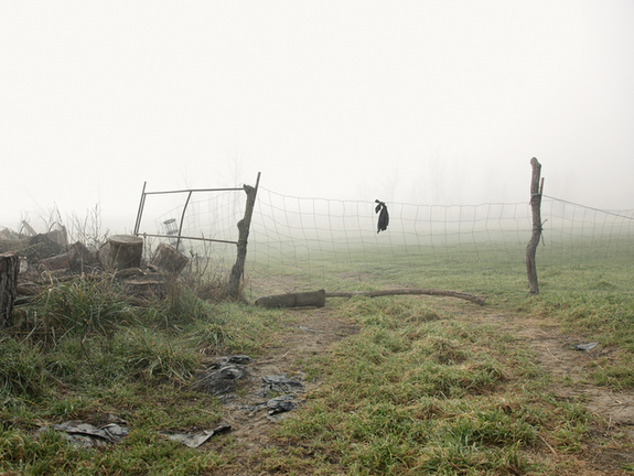
The series called Bounded Land is part of the project Resistance Activities that I have developed over recent years. Resistance Activities captures those landscapes in which the relationship of man with nature becomes visible. Man does not conform to inhabit the planet; he is trying to dominate the land and own it. 

Bounded Land makes visible the desire of men for control of territory, delimiting spaces. Man establishes borders every few meters to exploit the land, to declare his exclusive use. Each of the fences is a scar in the landscape, an attempt to stop the free and natural development of nature. Finally a vain attempt to control, because nature is resilient and will remain beyond any human attempt to master it. This fact is also reflected in some of my images.

— Ibán Ramón Rodríguez, Valencia, Spain

© Ibán Ramón Rodríguez

© Ibán Ramón Rodríguez

Jordi Huisman

© Jordi Huisman

www.JordiHuisman.nl

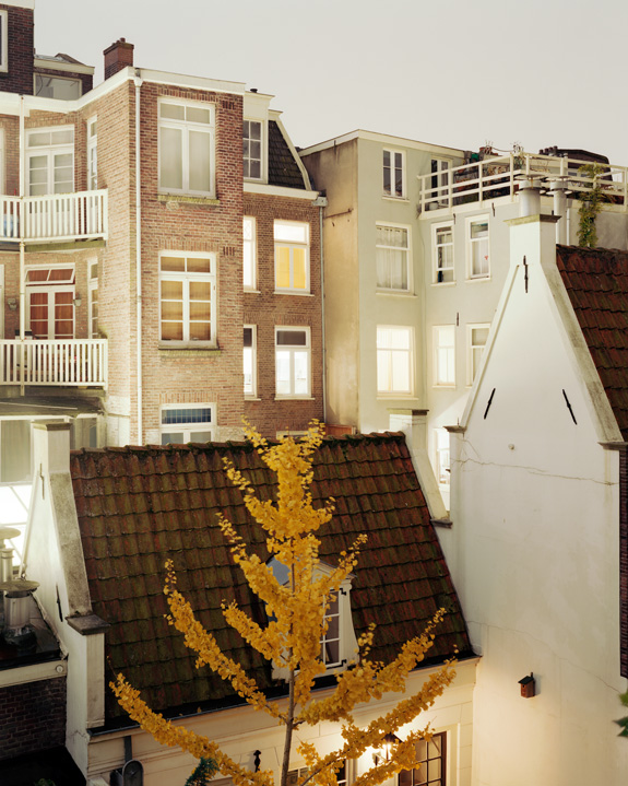
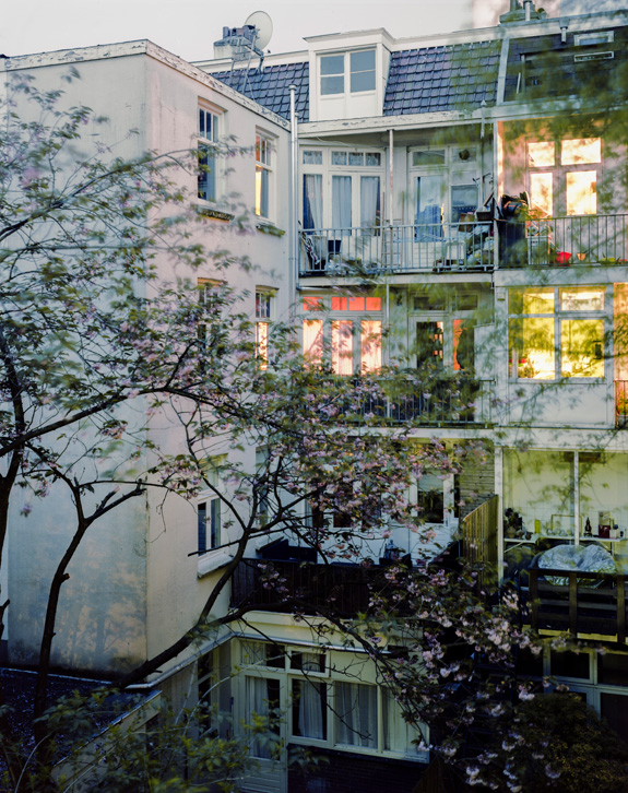
From the backs of residential buildings in old cities, one can see how people influence their surroundings. If a building block is designed at once, everything is mostly neatly aligned. In older cities a much more fragmented, spontaneous kind of architecture formed. This is in contrast with the facades on the fronts of buildings, which are clearly designed for appearance. 

The Rear Window series focuses on the backs of buildings in European capitals. It shows how someone for example decided to put a large satellite dish on his balcony, where the next door neighbor uses the balcony as a storage space. A small tree once planted in the court yard grew to be a massive obstacle. The series also has a voyeuristic aspect: through detailed exposures small details in the house of the residents become visible. Details that aren’t meant to be visible.

By photographing the views in different capitals, national differences and global chaos are captured.

— Jordi Huisman, Amsterdam, Netherlands

© Jordi Huisman